Background
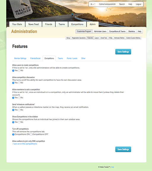
The client needed the the UI of their SaaS app redesigned and simplified because their users were struggling. The goal was to streamline the flow, remove unnecessary steps and pages, better integrate help docs & videos, and–ultimately–to reduce phone-support requests.Additionally, the original application was neither responsive nor touch-friendly and it needed styling upgrades.
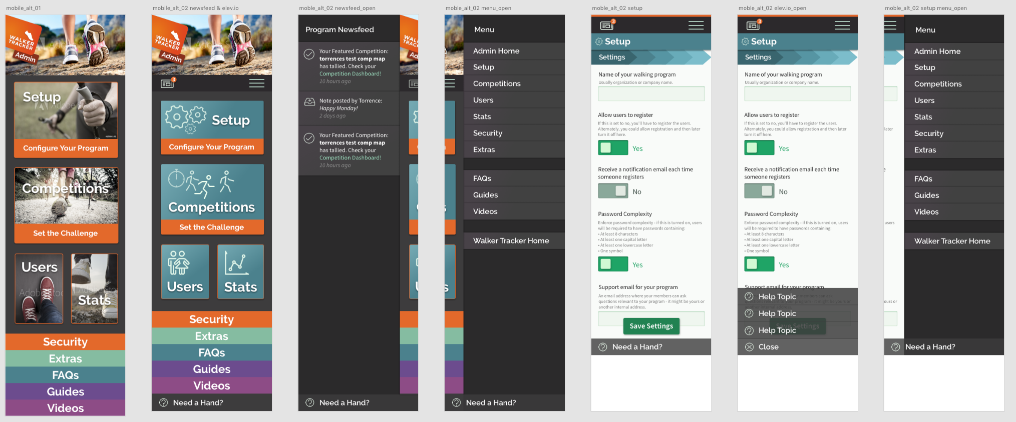
After working with client to identify pain points, accessibility problems, etc., I developed clickable wireframes (Adobe XD). These wireframes illustrate an improved user flow as well as reorganized menus & content.
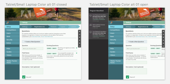
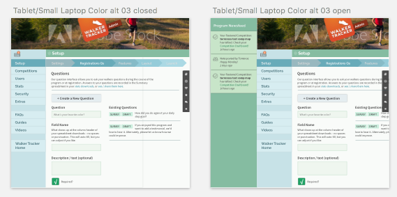
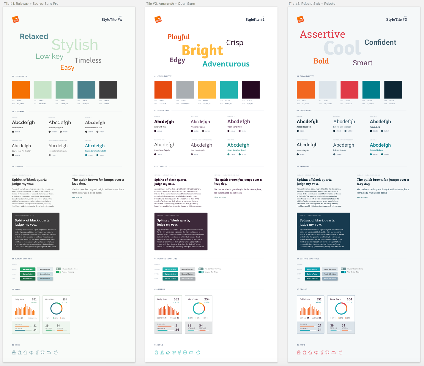
From there, the client was presented with general styling options (fonts/colors/forms) called style tiles. Upon the style tiles approval, we moved to high-fidelity mockups, using the selected styling options to demonstrate mobile and tablet/small desktop. Using Sketch & Adobe XD, some of the mockups were output as a simple clickable prototype.
Artifacts
Wireframes
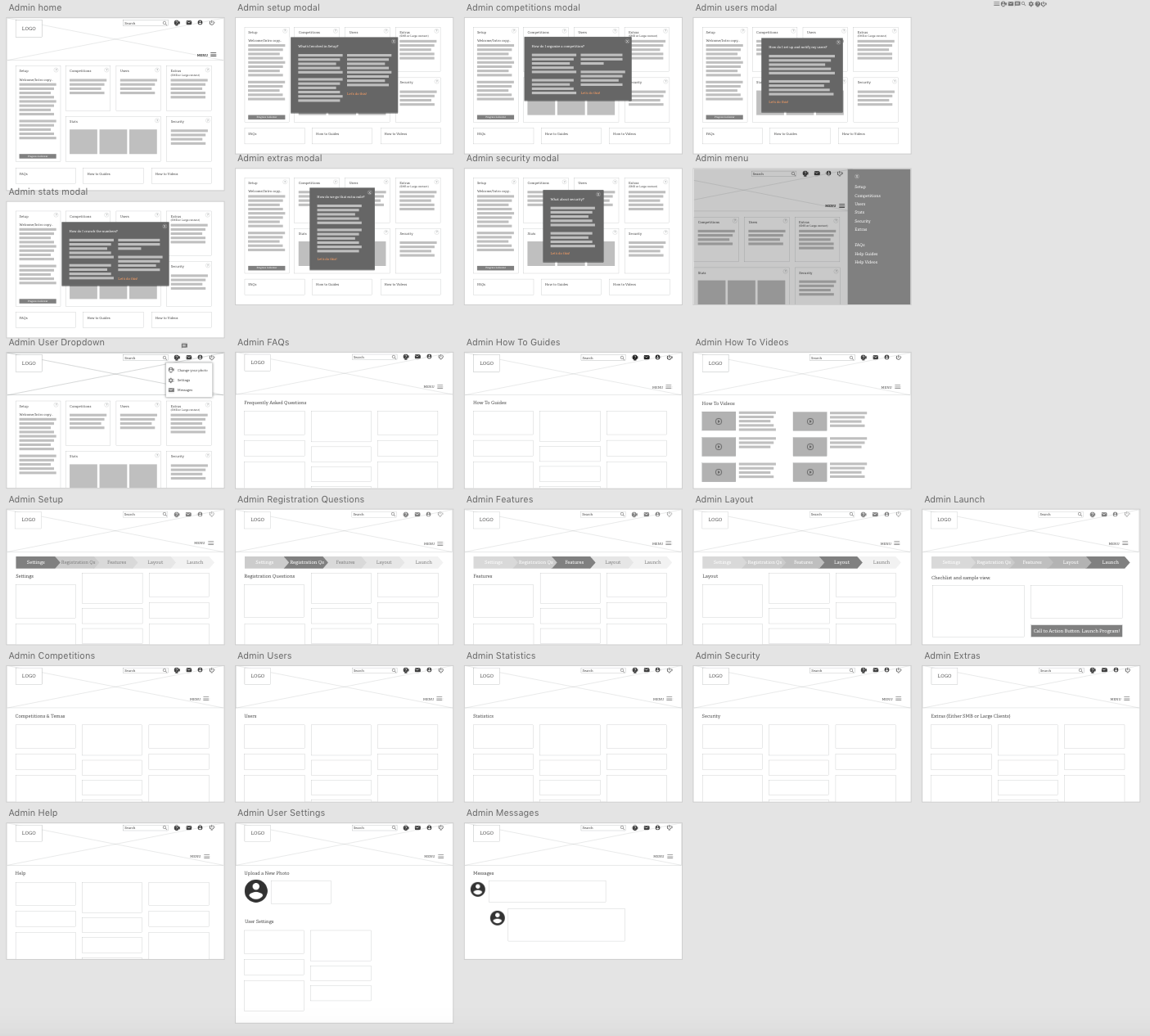
UX Improvements
- '?' opens help modals
- Setup displays linear progress list outline
- FAQs, guides & videos links easily accessed from admin home page
- Menu drawer offers easy navigation from any screen
Style Tiles (Look and Feel)
High-fidelity Mockups