Background
Part One
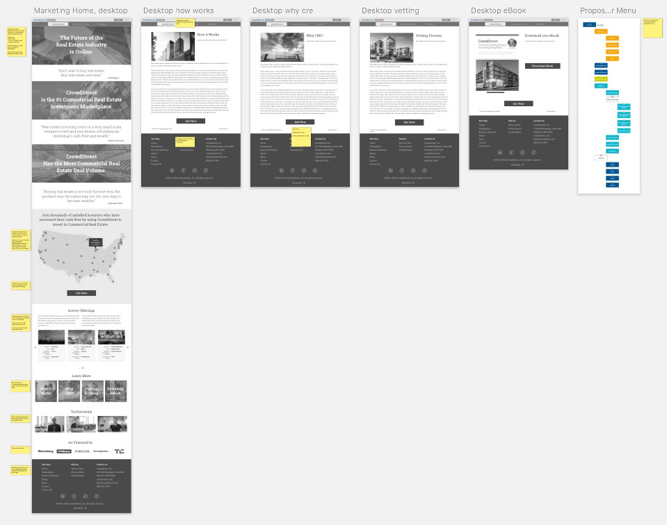
The original intent of this project was to refresh the existing marketing home page. However, the old site had been cobbled together by various engineers & contractors, resulting in a fragile code base. There was serious technical debt which slowed down the site. It was visually inconsistent with 4 sans serif fonts, no standard font-size, line-height or baseline grid. Most importantly, as a custom Django build, all content edits required Engineering to deploy. This seriously hindered Marketing from getting updates online in a timely manner. It was time for Marketing to have its own shiny, new CMS.
And so, after researching CMS options, we settled on WordPress. I was then tasked with the site design, build, deployment & maintenance. Phew!
Part Two
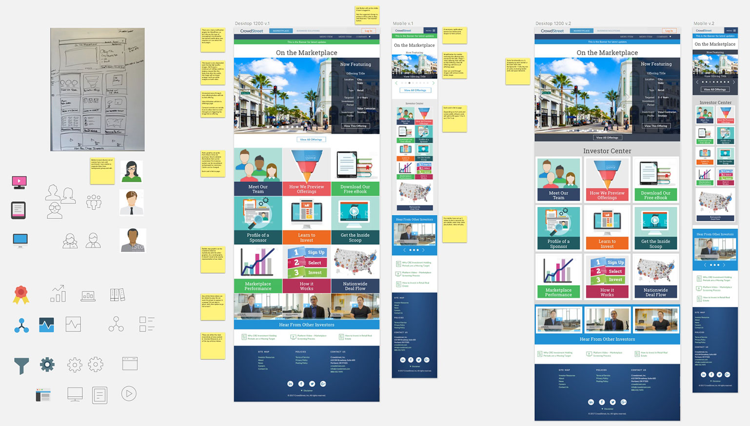
As design & development continued, the exec team concluded that as a company, we had 2 different audiences:
- Sponsors–those businesses who licensed/used our SaaS application (B2B), accordion
- Investors–those individuals who used the SaaS app to invest in offerings (B2C).
Thus was born the WordPress Multisite:
- CrowdStreet Home
- CrowdStreet Business Solutions for Sponsors, and
- CrowdStreet Marketplace for Investors.
Artifacts
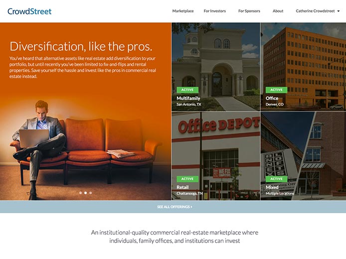
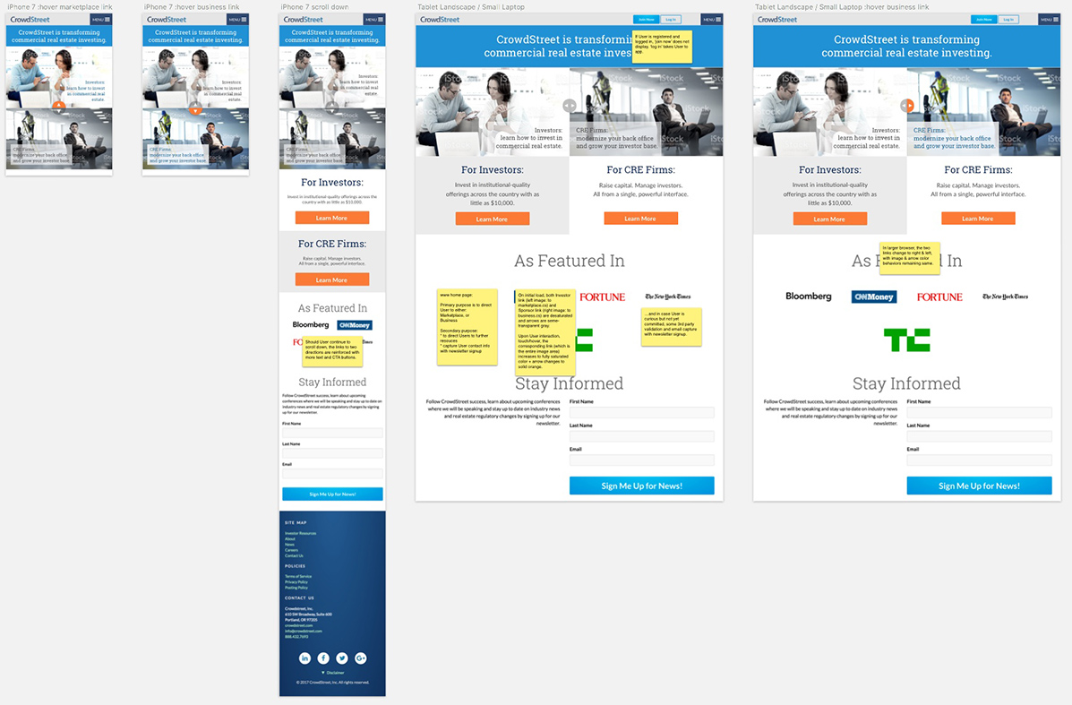
CrowdStreet Home
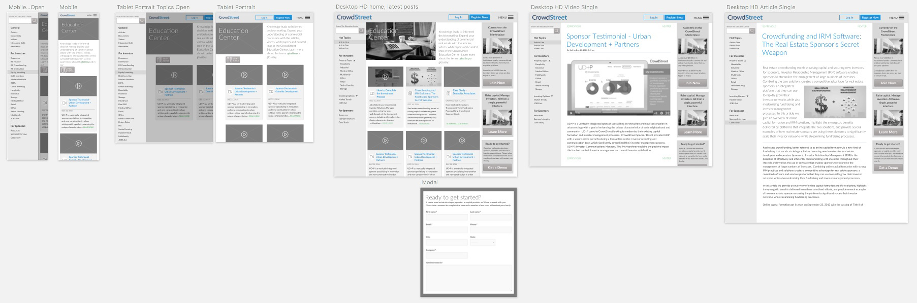
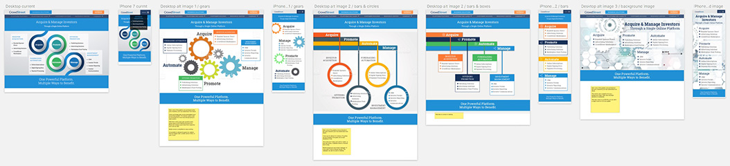
CrowdStreet Business Solutions

CrowdStreet Marketplace
2018 Update
In 2018, CrowdStreet underwent a complete rebranding, including implementing a completely new website.
So again...'Digital Ephemera Chef' FTW!