1
Research
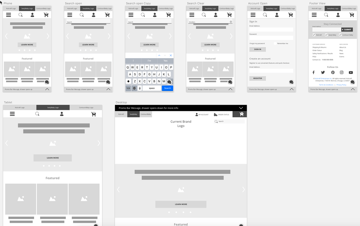
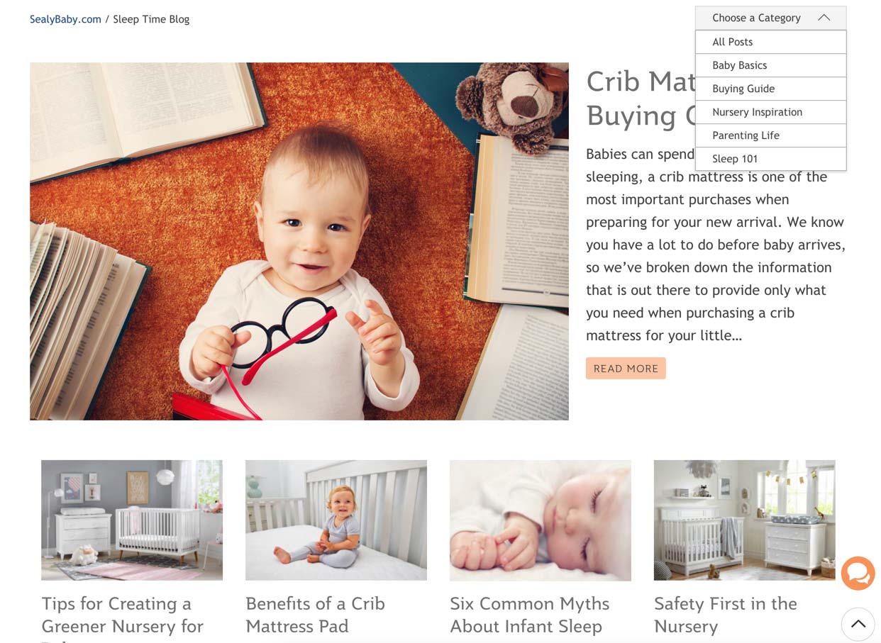
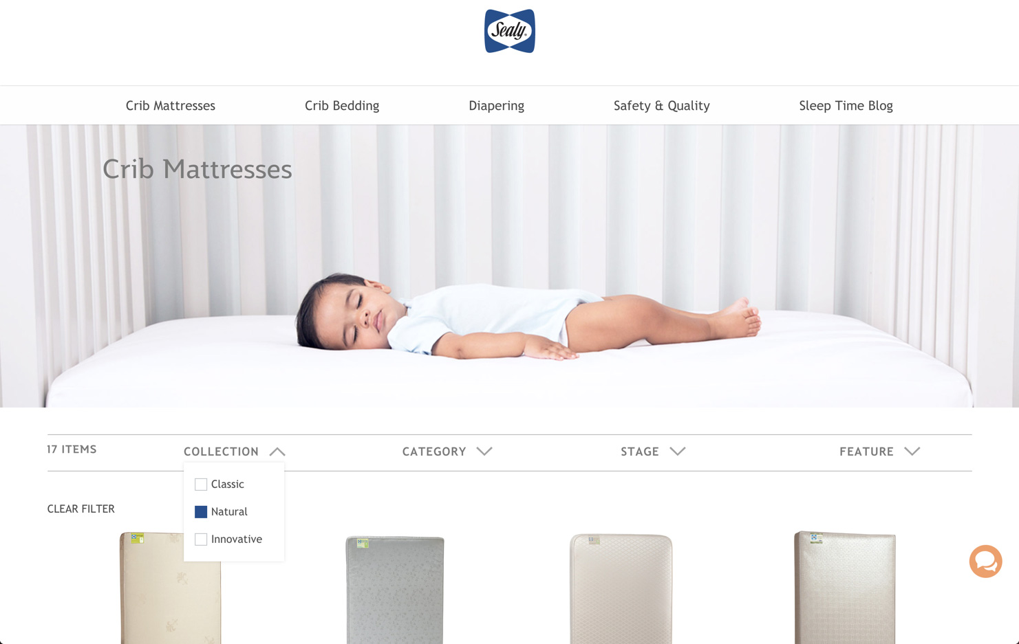
- Review other multi-brand eCommerce sites (like Gap/Old Navy/Banana Republic/Athleta) for how they toggle between brands; organize their headers, footers & menus; organize category structure; require sign on; and other shared functions.
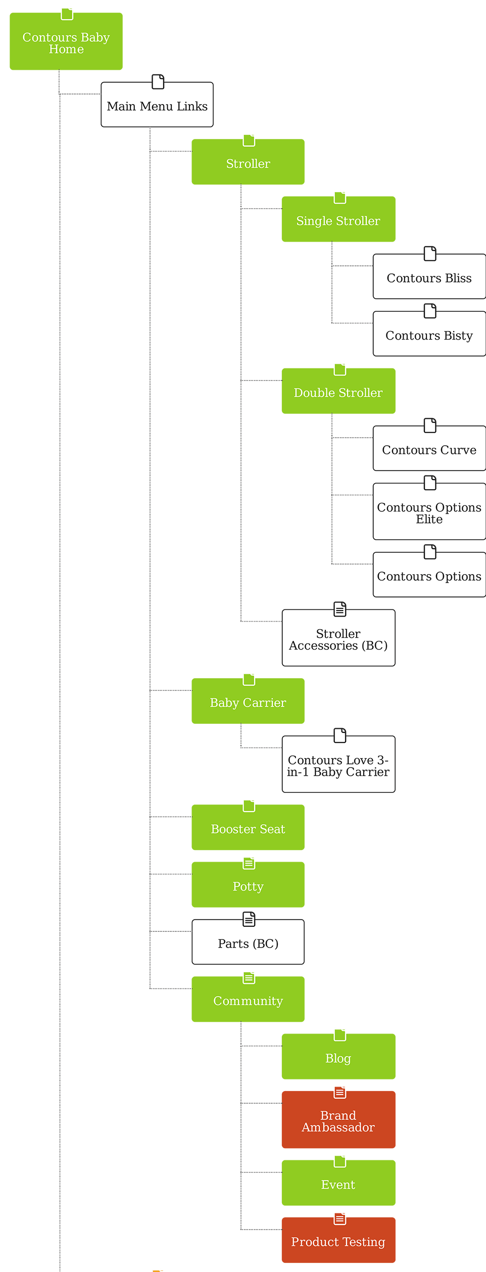
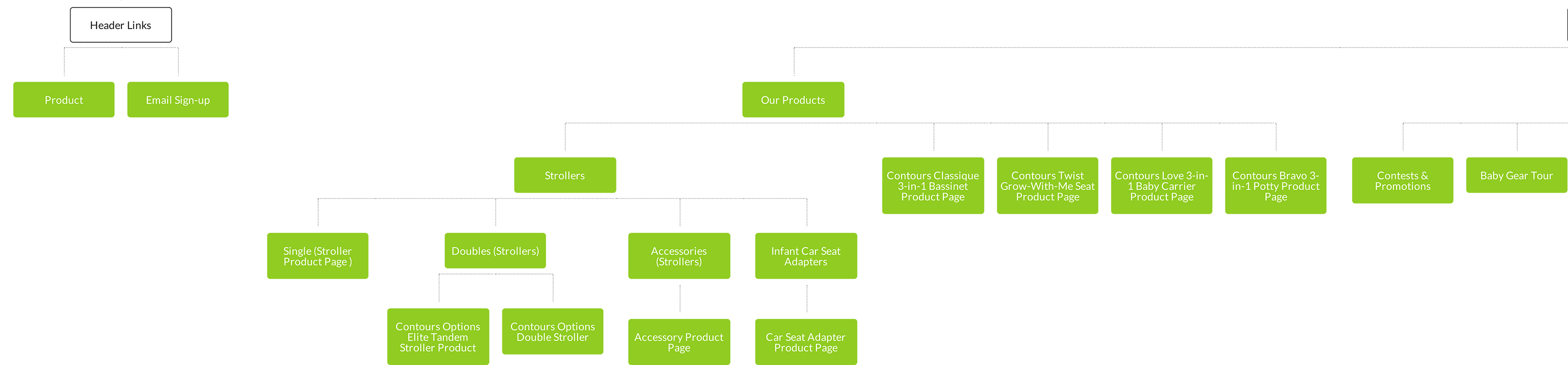
- Document existing Information Architecture and revise it to reflect consistent structure & menu options across brands. We used Writemaps, a cloud-based app that's perfect for sharing with and editing by clients/stakeholders.
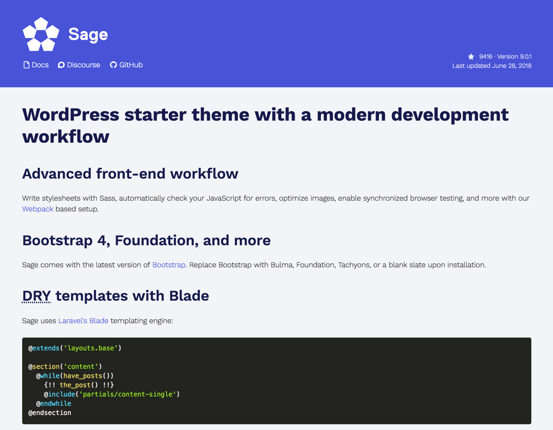
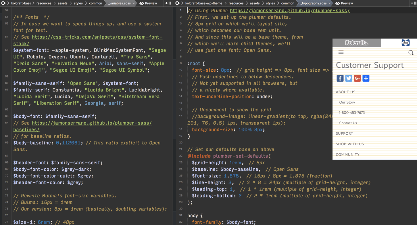
- Review modern WordPress base themes and development environments for best option to build a parent base theme & three child themes.